
All the tips here are available for non-Royale (their premium service) users. This includes fonts I have used and all the effects, overlays and tools. I am a Royale member though, and I highly recommend it, loads more fonts and amazing stuff becomes available to you, and it's under £3 a month. (I should point out that I am not affliated with Picmonkey. This article is my own opinion and it's my own money that paid for the Royale membership)
So I have three main tips and a bunch of little tricks. If you have any questions, please feel free to pop them in the comments I would be happy to clarify anything. I'm also really interested in seeing other Picmonkey tutorials so don't be afraid to link yours!

1. Starting with a blank canvas
Useful if you are looking to make something from scratch. I used this technique to make both my navigation bar (Those tabs with sections of my blog) and also my banner.

So easy that I wouldn't even call this a tutorial. Simply open any picture of a size equal to (or larger so that you can crop it down) the final image that you want.

Open the 'Overlays' menu item on the left, select either square or rectangle. Once it's placed stretch it big enough to cover the whole image and then some.

Use the toolbox to select a colour for your blank canvas. White is standard. You can then crop this to the size you want. See up there where it says 'Open', 'Save' & Share? Then there are two small arrows (undo and redo). The next is 'Flatten'. It merges all the layers in your image. So instead of being the original picture with a white box on top, your image will simply be a white box.
2. Jazz Up Your Banners (Layering Overlays)
I've spoken a few times about using a header image to show as your thumbnail on whatever sites you share your blog. You might like to make an image for anything, and want some text on it. Picmonkey offers a large range of overlays and one of the cool things you can do is layer them over one another to give a more professional polished look.

Start with the image that you want to add a banner to. This might be a blank canvas or an photo like above.

Open up the banners section and choose one you like. This also would look great with any of the geometric overlays. Be aware that it must be just one section - the banners with more than one solid piece won't work with this layering technique.
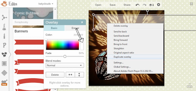
I've faded out the bottom overlay to blend it more into the image. Nice huh? I used a 50% fade. Next, duplicate the overlay by right clicking and selecting 'Duplicate Overlay'. Make it a bit smaller (trial and error will help here!) then think about colours. I used the light blue shade visable in one of this beautiful Morrocan light's shade. It's not immediately obvious, but if you click in the box that arrow is pointing to, your cursor will become a colour dropper and you can select any colour from your image. This is a great way to get a fully cohesive look.

Use your cursor to move the new coloured banner over the top of the first one. You can experiment with layering three or even four overlays together, altering the fade and colours with each. Position it so there is an even border. Cute!

I like to use this method to make banners for my text.
3. Funk Up Your Text - How to Add a Drop Shadow Effect
I wish that there was the option to add drop shadow and perhaps even an outline glow to the text in Picmonkey, but I've figured out how to DIY the drop shadow. This works with any solid overlay too!

Chose your font, click 'Add Text' and type what you want to say. Lobster Two is one of my favourite free fonts.

Right-click and duplicate the overlay, just as we did before. Now, the first text will be your shadow and the second your actual text. If you want your text to be black you'll need to make the shadow text a deep grey. Otherwise change only the colour of the top text.

Move the coloured text on top until just a teeny bit of the shadow is showing. It's really easy to adjust the angle of the 'lighting', just move around the top text until you are happy.

These little 'dings' to add a bit of sparkle to text - don't be afraid to experiment with all the options!
Because it's sometimes a hassle to get the shadow text in the right place to start off, I like to make this on a white background (see above) and then crop it right down so there is no additional space. Then I open up the image that I want to add the text to, and use the 'Use Your Own' overlay option. You'll be able to load up the ready made shadowed text and adjust it's size and position as a complete object. Easy!
I hope you had a lovely weekend! I had a great birthday, and I'm doing well with my 29 photos challenge. Are you following me on instagram yet?
This week I have a Valentines craft project that I've been working on for weeks, aswell as more information about my e-course on Social Media for Jobseekers :-)
Thank you for this tutorial! I love picmonkey and just started using it on my recipe blog. I'm going to have to try the banner trick-it looks so good transparent! Might even have to upgrade to Royale...
ReplyDelete-Kristen
feedingblake.tumblr.com